What is rebranding?
A rebrand is a transformation from the ground up. Think of it as a revolution, not just a new coat of paint, but a fundamental rethink of who you are, who you're speaking to, and how you want to be perceived.
This means changing the core: your positioning, your messaging strategy, your visual identity, your name sometimes, and the overall narrative you bring to the market. A rebrand isn't primarily a design project - design is the result of strategic decisions, not the starting point.
Rebranding reflects not only where you started, but where you're going. This change must be managed with careful attention to how people see, understand, and connect with your brand.
When you need a rebrand?
Rebranding is a significant investment in time, budget, and internal resources. It makes sense in specific situations:
- Market shifts. Customer behaviour, competition, and product expectations evolve. If your brand no longer fits where the market is heading, a rebrand helps you stay relevant rather than reactive.
- Internal changes. New leadership, a merger, an acquisition, or a major shift in business direction all require a rethink of brand positioning. What worked for the old company structure may actively work against the new one.
- Significant product or service evolution. When your offer changes substantially, whether you have moved upmarket, launched a new category, or pivoted, your existing brand may no longer represent the value you actually deliver.
- Repositioning. Entering a new market, targeting a different audience, moving into a premium segment all require a new perception. You can't just tell people you've changed. The brand has to show it.
- Reputation repair. Sometimes a rebrand is about rebuilding trust after something went wrong. Done carefully and honestly, it can help reset perception and create a stronger emotional connection with the audience.
What does a rebrand actually involve?
A proper rebrand isn't a logo swap. It typically covers:
- Brand strategy: positioning, differentiation, audience definition, value proposition
- New naming (sometimes) and brand architecture
- Visual identity: logo, colour system, typography, iconography, photography direction
- Messaging framework: tone of voice, tagline, core narratives
- All touchpoints: website, sales materials, social media, packaging, internal culture
Timeline-wise, a full rebrand for a growth-stage company typically takes two to six months. Budget varies widely, but it is not a small project; a rebrand done properly requires strategic and creative expertise, not just execution.
5 rules of a successful rebrand
- Start with strategy. Design should be the result of strategic decisions, not the other way around. If you're picking fonts before you've defined your positioning, you're doing it backwards.
- Align the new identity with what your company has become, not what it used to be. The brand should reflect your current level of expertise, not your origin story.
- Protect what's already working. Brand equity is valuable. If certain elements (colour, a brand voice, a recognisable mark) still resonate with your audience, keep them. Selective preservation isn't compromise, it's smart.
- Build a complete brand system. Messaging, tone of voice, customer experience, website, sales materials, internal culture, all needs to reflect the new identity. Partial rebrands create inconsistency, which undermines trust.
- Manage the transition deliberately. How you introduce the new brand matters as much as the new brand itself. Be clear with your existing audience about what changed and why.
What is a brand refresh?
A brand refresh is an evolution, not a revolution. It is the right move when your brand is still fundamentally strong, the strategy, positioning, and core identity are solid, but the expression has fallen behind.
Think of it as updating the wardrobe, not changing who you are. The company's values and direction stay the same. What changes is how those things look and sound: a refined logo, updated colours or typography, modernised messaging, a redesigned website. The goal is to stay recognisable while becoming more relevant.
When you need a brand refresh?
- Your visuals feel outdated. Design trends evolve, digital environments change, and what looked modern five years ago can now work against you. A refresh makes sure you're not losing credibility just because of how you look.
- Your identity is inconsistent across platforms. If your LinkedIn looks different from your website, and your website looks different from your pitch deck, that inconsistency signals a lack of attention, even if the underlying work is excellent.
- You're launching a new product or expanding your offer. As your product range grows, your brand needs to be flexible enough to carry it. A refresh can update the visual system to accommodate new offerings without creating confusion.
- Your visuals don't match your current quality level. This one is underrated. If your work has improved significantly but your brand still looks like an early-stage studio or agency, you're underselling yourself every time someone lands on your website.
- You need to differentiate in a crowded market. Sometimes a visual and communication update is all you need to stand out, not a full identity overhaul, just a sharper, more distinctive expression of who you already are.
What does a brand refresh actually involve?
A refresh is more focused than a rebrand. Typically it covers:
- Logo refinement (not replacement)
- Updated colour palette and typography
- Evolved messaging and tone of voice
- Redesigned website or key marketing materials
- Improved consistency across all digital touchpoints
Timeline is shorter, usually six to twelve weeks depending on scope. The investment is also significantly lower than a full rebrand, which makes it the right choice when the strategy doesn't need to change, just the expression.
5 rules of a successful brand refresh
- Preserve recognisability. The whole point is to modernise without starting over. If your audience stops recognising you, you've done too much.
- Focus on relevance to your market, not design trends. Chasing aesthetic trends for their own sake dates your brand faster than it refreshes it.
- Update consistently across all touchpoints. A refreshed logo on your website but old materials everywhere else creates more confusion than it solves.
- Use the refresh to improve clarity and usability. Better hierarchy, clearer messaging, and a visual system that actually scales are real improvements, not just aesthetic ones.
- Make every change serve a clear business objective. If you can't explain why a change was made in terms of what it does for your positioning or your audience, it probably shouldn't be there.
Rebrand vs Refresh: an easy decision framework
Choosing between a brand refresh and a rebrand is first of all a strategic decision. The key factor is the scale of change in your business. If your positioning, audience, or core offer has evolved, your brand must reflect that. If the strategy is still right and only the expression feels off, a refresh is usually enough.Answer these questions honestly:
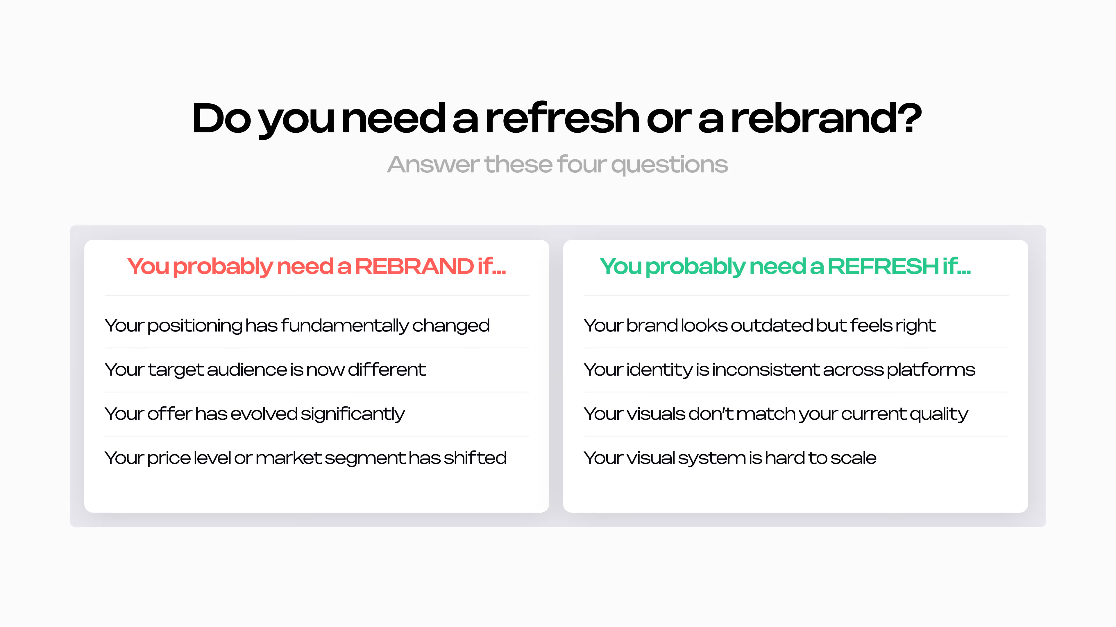
If most of your answers fall in the left column, your business has already changed and your brand is lagging behind. In this case, a rebrand is the strategic decision to close that gap and communicate your current level to the market.
If most of your answers are in the right column, your foundation is strong. What you need is a visual and system update, that improves consistency, sharpens relevance, and makes the brand easier to scale.
What if your answers are split evenly? That's more common than you'd think.
It usually means your strategy is still valid, but you have reached a real turning point, maybe you are moving slightly upmarket or starting to target a new audience without making a fully pivoting.
In this case, a refresh that includes a strategic messaging update can bridge the gap without the cost and disruption of a full rebrand. A good brand partner will help you identify exactly which elements need to change and which don't.
The risks of choosing wrong
This is not just a creative decision; it directly affects how fast you grow and how efficiently you use resources.
When a refresh isn't enough
A visual update can't communicate a fundamental shift in what your company is. If your positioning, offer, or target audience has evolved but the core identity stays the same:
- The market keeps perceiving you at your old level
- You attract the wrong type of clients
- Your new pricing becomes difficult to justify
- Your expertise gets consistently underestimated
The business moves forward, but the brand holds it back. This is one of the most common and most expensive brand mistakes at the growth stage.
When a rebrand is too much
A full rebrand without a real strategic reason creates a different set of problems:
- You lose recognisability and the brand equity you've built
- Existing customers get confused
- You signal instability, not growth
- You spend significant time and budget on something a refresh would have fixed in a fraction of the time
The goal isn't to change more. It's to change at the right level.
Real-world examples
It's easier to understand the rebrand vs refresh decision when you can see how it played out for real companies - what worked, what didn't, and why. Here are six examples across three categories: successful rebrands, rebrands that went wrong (and one that's still debatable), and brand refreshes done right.
Successful rebrands
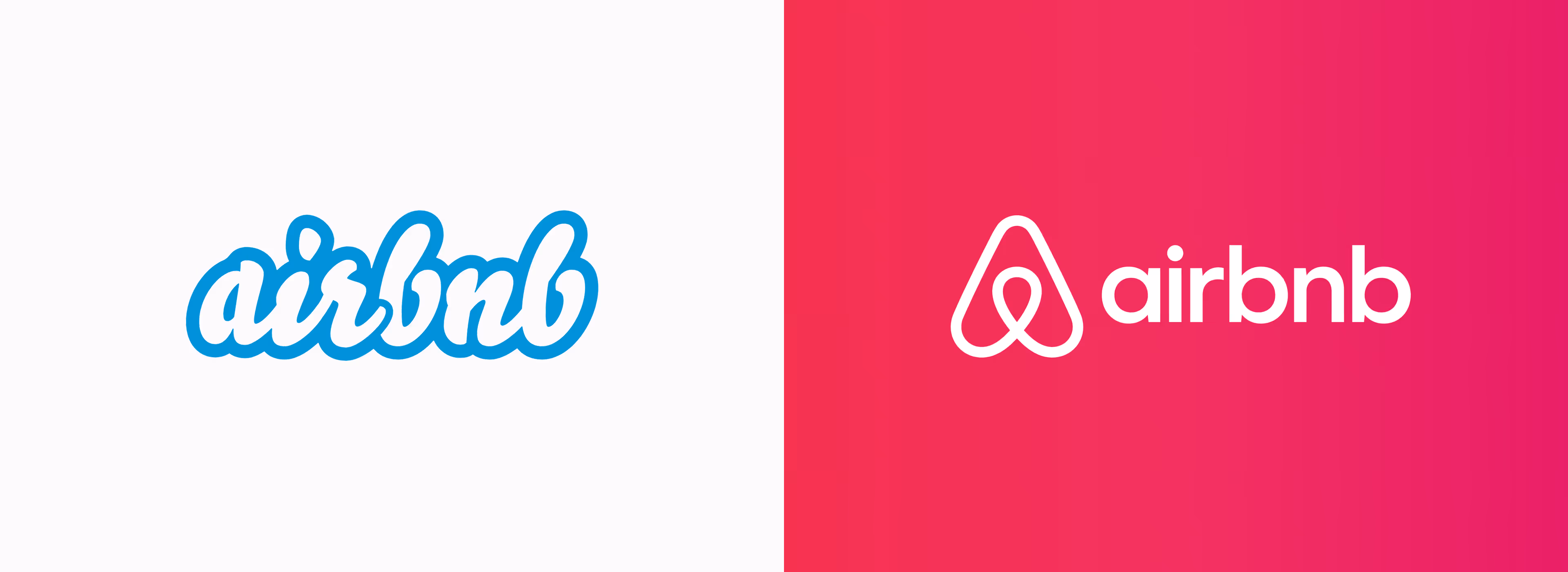
When the whole identity needed to change: Airbnb (2014)
When Airbnb introduced the Bélo symbol in 2014, it wasn't a simple update. The company had grown from an air mattress rental service into a global community platform, and the old brand, built around budget travel, no longer communicated what the product had become.
The rebrand redefined Airbnb's positioning. They introduced new logo, new visual language, new narrative, everything changed because the company itself had fundamentally changed. The strategy shifted first. The brand followed.
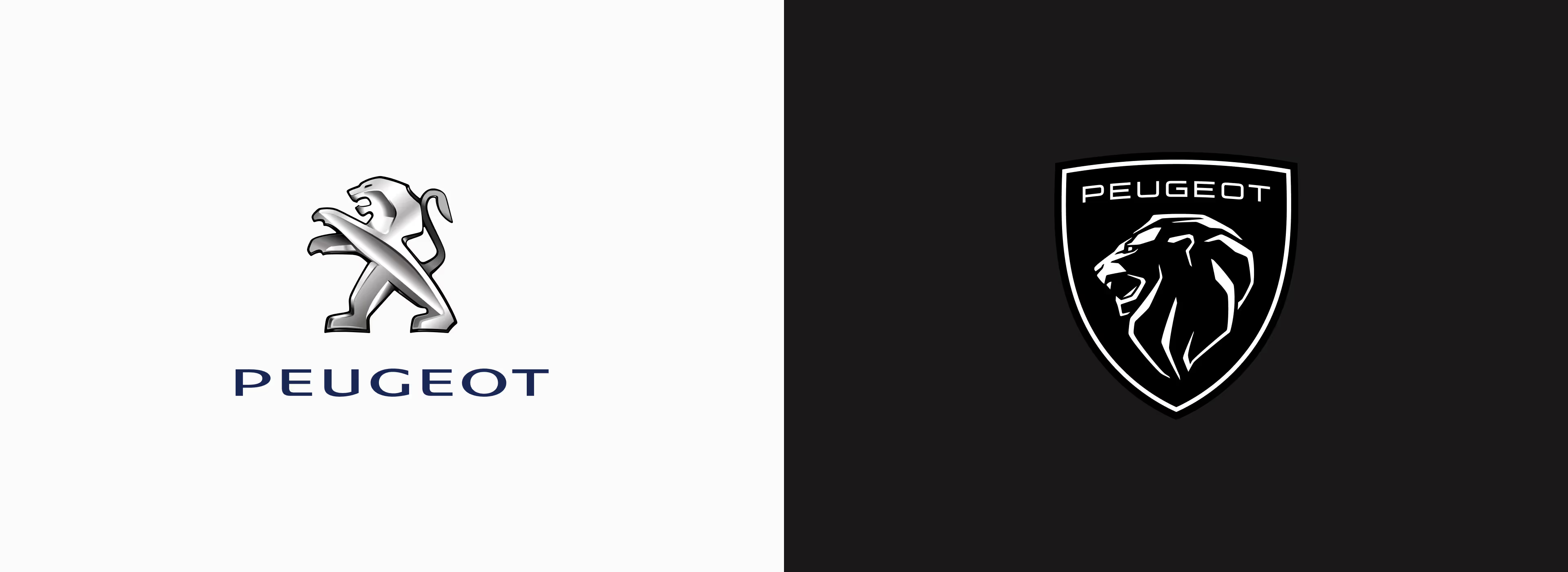
When the product moves upmarket and the brand has to follow: Peugeot (2021)
Peugeot's 2021 rebrand is one of the cleaner examples of a brand identity catching up with a strategic shift that was already underway. For several years before the rebrand, Peugeot had been deliberately repositioning by moving away from the budget and mid-range segment toward genuine premium territory. The product lineup, the interior design language, the pricing; all of it was already moving in that direction. The brand identity hadn't.
Importantly, with the new identity system, the lion logo itself was kept, a symbol with over a century of heritage, but completely redrawn to fit where the brand was going, not where it had been.
The Peugeot rebrand works as an example precisely because the strategy shifted first, and the identity followed. By the time the new logo launched, the company had already done the hard work of repositioning through product and pricing. The rebrand wasn't trying to create a perception that didn't exist, it was formalising one that was already developing. That sequencing matters.
Rebrands that went wrong
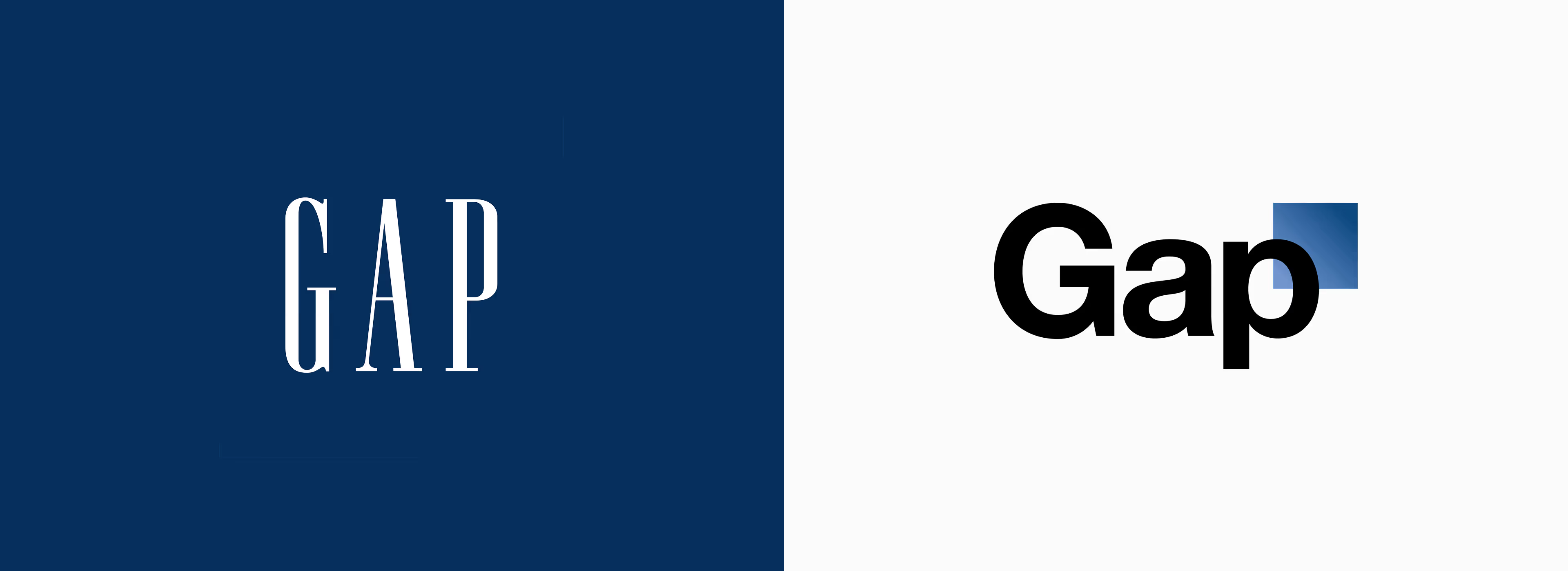
When there was no strategy behind the change: Gap (2010)
Gap's 2010 logo change is one of the most cited examples of a rebrand that failed. Not because the new logo was terrible, but because there was no strategic rationale behind it. No new positioning. No new audience. No meaningful shift in the business. Just a new logo.
The backlash was immediate and overwhelming. Customers, designers, and the wider public rejected it loudly. Gap reverted to its original logo within six days, one of the fastest public retreats in brand history.
Bold move or brand suicide? Jaguar (2024)
In late 2024, Jaguar unveiled a complete rebrand with a new logo, new visual identity, new brand world, and a repositioning as a fully electric luxury brand targeting a younger, wealthier demographic. The response was one of the most polarised in recent brand history.
The execution felt disconnected from anything recognisably Jaguar. The campaign generated massive backlash online, with many arguing it alienated a loyal existing customer base without clearly explaining what the new Jaguar actually stands for. Dropping 'leaper' iconography and heritage cues entirely felt like erasing rather than evolving.

Personally, I think it's too early to call. Jaguar hasn't released new cars under the new identity yet. We can only learn from it, that a rebrand can be strategically justified and still be poorly executed. Having a real reason to change is not enough; the new identity has to communicate the new direction clearly enough for the audience to follow.
Brand refreshes done right
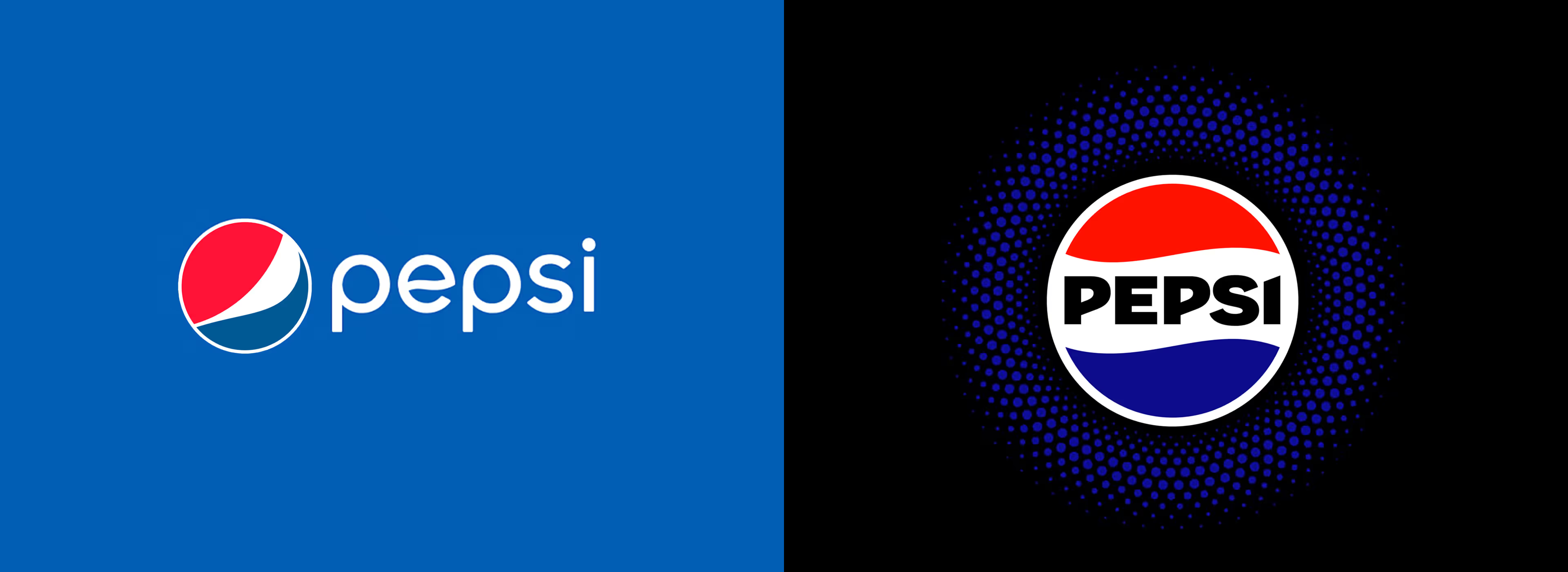
When standing out on shelf becomes a strategic priority: Pepsi (2023)
Pepsi's 2023 refresh is a clean example of a brand updating its visual expression without touching its positioning or strategy. Pepsi didn't change what it stands for, who it's talking to, or how it competes with Coke. What it did was sharpen how all of that stands out more clearly on shelf among competitors.
A refresh doesn't need to reinvent anything. Pepsi's core identity remained. What changed is the confidence and clarity of the expression. Sometimes that's exactly enough.
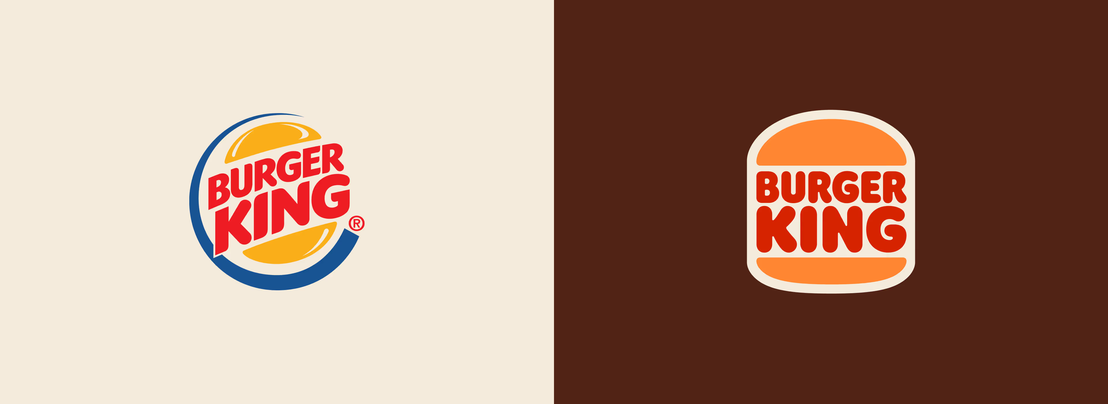
When going back is actually moving forward: Burger King (2021)
Burger King's 2021 refresh is an interesting case because the move that made it feel modern was actually a step backward in time. The refresh stripped all of that back and drew directly from Burger King's 1969–1994 identity. The result felt immediately fresh, not because it was chasing current design trends, but because the older visual language was simply cleaner and more confident than what had replaced it.
The positioning didn't change. The audience didn't change. The core brand associations stayed entirely the same. What changed was how clearly and appetisingly all of that came through in the visual system.
The bottom line
Both a rebrand and a brand refresh exist to solve the same core problem: the gap between how your company actually operates and how the market perceives it. The difference is scale.
If your business has fundamentally changed, with new positioning, a new audience, or a new level of expertise, your brand needs to catch up. That is a rebrand.
If the strategy is solid but the expression is falling behind, a refresh is the more efficient and focused choice.
The goal isn't to change more. It's to change at the right level, for the right reasons, in a way that supports where you're actually going.
At Clustr Studio, we approach every brand project, whether it is a refresh or a full rebrand, the same way: strategy first, design second. If you are trying to work out which one you need, that is usually the first conversation worth having.