Why brand colours matter more than you think
Colour is one of the most powerful and most underestimated tools a brand has. It works on a psychological level before your audience even reads a single word about you.
Brand colours do more than just make things look good. A strategically chosen colour palette:
- Builds instant recognition (think Spotify's green or Tiffany's turquoise)
- Communicates your brand personality without words
- Creates powerful effect on our emotions by influencing behaviour
- Differentiates you from competitors in crowded markets
- Keeps you consistent across every customer touchpoint
The mistake most businesses make is treating colour as an afterthought, something chosen because of trends or personal preference. Great brands treat colour as a strategic decision, made early, deliberately, and keeping audience and market in mind.
Step 1: Define your brand personality first
Before you open a colour picker, get clear on what your brand actually stands for. Colour is a language. Before you can speak it fluently, you need to know what you're trying to say.
Start by defining how you want your brand to be perceived.
Are you premium or accessible? Bold or calm? Playful or authoritative? Innovative or traditional? These answers create the emotional framework your colour palette will later express.
Your core values matter here too. If your brand stands for sustainability and transparency, overly aggressive or artificial-looking colours will create a disconnect. If you're built on speed and disruption, muted tones might water down your message.
A simple way to start — answer these two questions:
- What three adjectives should customers use to describe their experience with your brand?
- How do you want people to feel when they interact with it?
Keep these answers close. They'll act as a filter for every colour decision you make from here.
Step 2: Understand colour psychology
Colour psychology explains how colours affect human perception, emotion, and behaviour. In branding, it's the science behind choosing colours that trigger the right response in your audience.
One important thing to remember: colour psychology isn't universal. Context, culture, and industry all shape how a colour is perceived. The same colour can mean completely different things depending on where and how it's used.
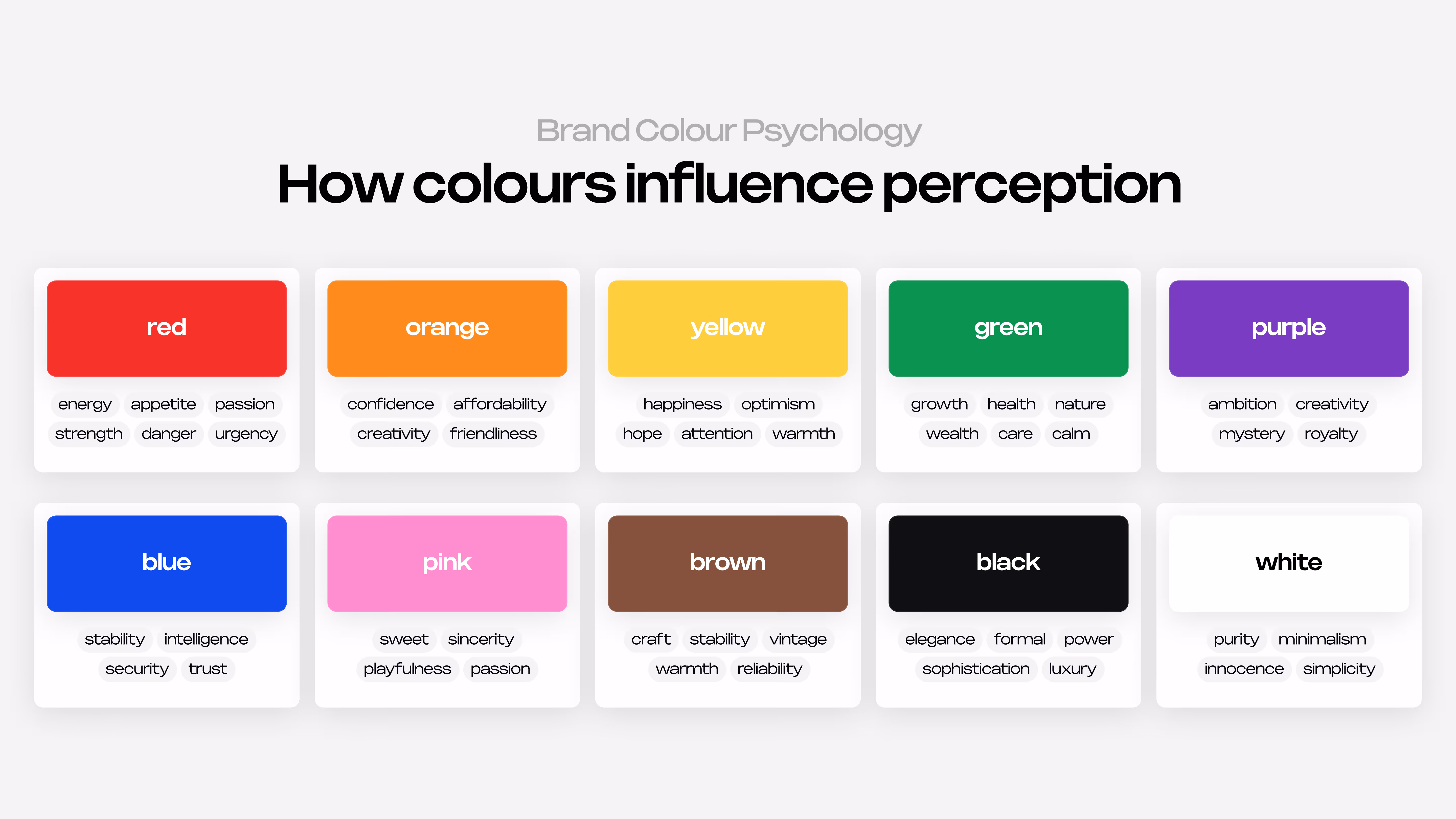
Use the visual above as a reference point, but always interpret it through the lens of your specific industry and audience, never in isolation.
Step 3: Research your competitors' colour choices
Before you land on your own colours, map out what's already being used in your market. Every industry has unwritten colour norms and you need to decide whether to follow them or strategically break them.
The Fast Food colour case
Almost every major fast food chain including McDonald's, Burger King, KFC, Pizza Hut, Wendy's uses red and yellow in their branding. This is not a coincidence. Red stimulates appetite and urgency. Yellow triggers happiness and signals low prices. They're scientifically optimised for the category.
But when a challenger brand enters the fast food space and positions itself as healthier or more premium, brands like Joe & The Juice or Sweetgreen deliberately reject red and yellow. They go for green, white, and pink instead, signalling a completely different set of values. Their colour choice alone communicates the difference before the customer reads a word.
The visual below shows colour combinations across ten industries. Some follow category norms, others break them deliberately — both can work when the choice is intentional.

Notice how deep navy works for Finance and bold red for Sports. They signal exactly what those audiences expect to feel. But hot pink for Food & Beverage or burgundy instead of the predictable black and gold for Luxury are strategic breaks from convention.
The point isn't that one approach is right and the other is wrong. It's that every colour decision here is intentional. Whether you follow category norms or break them, the reasoning should always come back to the same question: what do I want my audience to feel the moment they see this?
How to run your competitor colour audit
- List your top 8-10 direct competitors
- Capture their primary, secondary, and accent colours (any colour picker tool works)
- Plot them on a simple colour wheel and look for clusters
- Ask: which colours are absent from my market? Which colours dominate?
- Decide: do you want to blend in or stand out?
Pro tip: If you want to be seen as the safe, established choice in your category, lean into the dominant colour conventions. If you want to disrupt, look for the unoccupied colour territory.
Step 4: Know your audience's colour preference
Your personal preference for a colour is irrelevant. What matters is what your target audience associates with it. and those associations shift based on age, culture, and context.
Age and generational differences
- Gen Z and younger Millennials are comfortable with bold contrasts, expressive palettes, and value-driven colour choices that signal sustainability or digital-first thinking
- Gen X tends to lean toward balanced, professional combinations that feel stable rather than experimental
- Baby Boomers often respond best to time-tested associations such as navy for trust, green for health, burgundy for quality
This doesn't mean you have to follow generational stereotypes. But you do need to know what feels intuitive and credible to your specific audience.
Cultural context matters
Cultural associations can completely flip the meaning of a colour. A few important ones to be aware of:
- White: purity and weddings in Western cultures; mourning in China, Japan, and parts of India
- Red: danger or Christmas in the West; luck, prosperity, and celebration in China
- Green: health and nature in Western markets; sacred in some Islamic cultures; associated with infidelity in China
- Purple: royalty in Europe; mourning in Brazil and Thailand; wealth in Japan
If your brand operates internationally, colour associations in your key markets need to be checked before you launch.
Validate with real data
Don’t guess. Ask and test.
– Run quick surveys with your audience "Which of these colour palettes best represents how you see our brand?"
– A/B test colour variations in ads or landing pages
– Analyse the colour palettes of brands your audience already follows and buys from
– Run focus groups if you have the budget
Step 5: Choose your primary brand colour
Once you've done the groundwork brand personality, colour psychology, competitor research, audience insight — you're ready to pick your primary colour. This is the anchor of your entire visual identity.
Your primary colour is the one that:
- Appears most frequently across all your brand touchpoints
- Is most strongly associated with your brand in the customer's mind
- Genuinely reflects your brand personality and speak to your audience
When you're choosing, don't just pick a colour, pick a specific tone. A muted sage green carries completely different energy from a vivid lime green, even though they're technically the same colour. Test variations in saturation and brightness until the tone feels right.
Step 6: Build your full colour palette
One colour is a start, but a brand palette is a system. Most professional palettes have three layers: a primary colour, secondary colours, and neutrals.
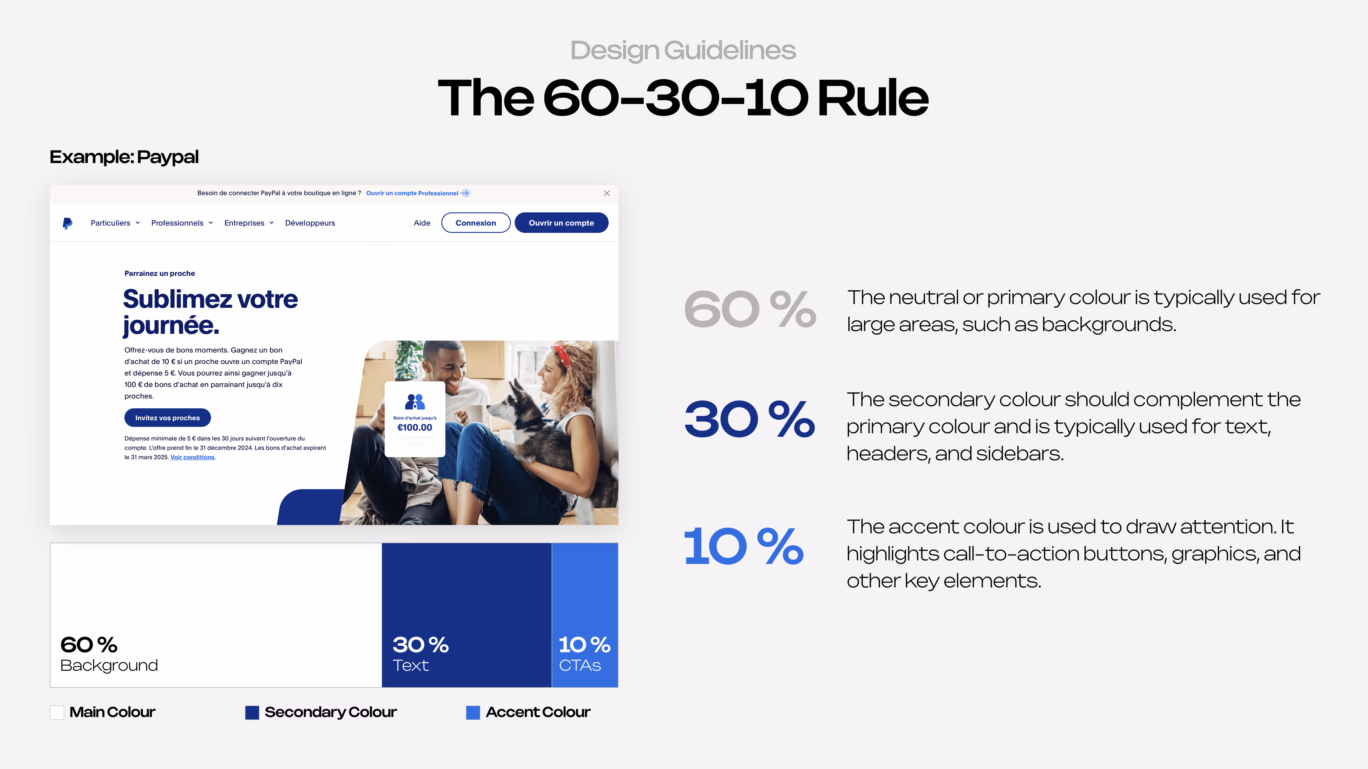
The 60-30-10 Rule
This is the simplest framework for using your colours proportionally:
- 60% — Your dominant colour. This is the background, the breathing room, often a neutral or your primary at low saturation.
- 30% — Your primary brand colour. Used for key elements, headers, and main brand moments.
- 10% — Your accent. Used for calls to action, highlights, and anything you want to draw the eye to.
Give every colour a job
Each colour in your palette should have a clearly defined purpose. When you're building it out, document what each one is actually for:
- Primary colour: logo, hero moments, key headings, main CTA buttons
- Secondary colour: supporting visuals, icons, dividers, hover states
- Accent colour: call-to-action elements, badges, highlights
- Light neutral: page backgrounds, card backgrounds, white space
- Dark neutral: body text, footers, dark mode surfaces
Resist the urge to add more colours than you need. A focused palette of 3–5 colours (including neutrals) is almost always more powerful than a sprawling one.
Step 7: Test for accessibility and versatility
Choosing beautiful colours is only half the battle. They need to actually work in the real world across different screens, sizes, and contexts.
Start by testing how your colours behave together with text. A combination that looks refined in a large headline can become unreadable in body text or on a mobile screen. A few quick checks:
- Test your primary text colour on white, dark, and brand-coloured backgrounds
- Verify that buttons and small UI elements are clearly readable with your accent colours
If you have to strain to read it, it won't work for your audience. Good contrast is an accessibility requirement.
It's also worth seeing your palette in real use cases before you commit. Draft a social media post, a presentation slide, or a simple landing page section using your chosen colours. This immediately reveals whether the system feels balanced or chaotic, whether one colour is dominating too much, or whether you're missing a neutral to support the brighter ones.
Step 8: Document your brand colour guidelines
You've done the strategic work. Now protect it. Brand colours are only consistent if they're documented, shared, and enforced, and that means a brand style guide.
It doesn't need to be a 50-page document. A clean two to four page reference is often enough for a growing brand. What matters is that anyone working on your brand (freelancers, agencies, internal team members) has a single source of truth to work from.
Your brand colour guide should include:
- Your primary, secondary, and neutral colours displayed visually
- HEX, RGB or CMYK codes for each colour
- The defined purpose of each colour (what it's for)
- Do and don't examples: acceptable and unacceptable combinations
- Colour usage ratios (the 60-30-10 breakdown)
- Minimum contrast requirements for accessibility compliance
Common brand colour mistakes to avoid
Even with good intentions, brands make the same colour mistakes repeatedly. Here are the most damaging ones:
- Choosing colours you personally love. Choosing colours you personally love over what fits the brand. Your favourite colour is irrelevant. The only question that matters is: does this colour serve my audience and my positioning?
- Using too many colours. A palette of six or more colours creates visual chaos and makes your brand feel inconsistent. Stick to three to five.
- Not testing across mediums. A colour that looks stunning on your big display might look washed out in print or garish on a mobile screen. Always test in context.
- Copying a competitor's palette. Using the same dominant colour as a major competitor creates confusion and makes differentiation harder. Your colour audit in Step 3 exists precisely to prevent this.
- Ignoring cultural implications. If you serve global or multicultural markets, colour associations in your key regions need to be validated before launch.
- Skipping accessibility testing. Inaccessible colour combinations exclude users with visual impairments and can create legal liability for established brands in regulated industries.
- Choosing trendy colours over timeless ones. Colour trends come and go. Brands that chase Pantone's Colour of the Year often find themselves looking dated within a few years. Build for longevity.
- Never revisiting your palette. Brand colours should evolve as your business matures.
Quick Summary of Colour Selection Proccess
Here's the quick summary of full process:
- Before touching any colour tool define your brand personality
- Study colour psychology for your market, audience, and cultural contexts
- Conduct a competitor colour audit to understand what territory already exists
- Validate colour preferences with your actual target audience
- Select a primary brand colour that embodies your personality
- Build a full palette using the 60-30-10 rule
- Test every combination for accessibility and versatility across mediums
- Document everything in a brand style guide
Your brand colours are not just a design choice, they're a strategic business decision. Make them with the same rigour you'd apply to any other important decision, and then commit to them with the same consistency.