What makes the IT niche different
Three things make this niche different from a standard business website.
The product itself is technically complex.
You can't simplify what you don't understand. If the person writing your copy doesn't take the time to understand how your product works, you'll end up with vague messaging on the homepage and a long list of revisions once your team reviews the prototype.
The answer isn't a better writer. It's taking the time to understand the product well enough that a first-time visitor can grasp it quickly, without getting lost in jargon.
Clarity and depth pull against each other.
You get seconds, not minutes, to make the point. That pressure tempts people to flatten the copy until it says nothing at all. The actual skill is packing in enough substance that a technical reader takes you seriously, while keeping sentences understandable enough that a non-technical one doesn't bounce.
More than one person approves it, and they all use different standards.
If your company has multiple products or departments involved, everyone ends up judging the same page by different standards.
Product cares about precise wording. Marketing cares about clarity for the buyer. Leadership cares about business results. One person approves a line, another rejects it, and the timeline stretches without anyone deciding it should.
This is the part that costs real money if it isn't planned for. Reviews always surface new ideas: one more section, a deeper breakdown of a product line, case studies that need their own pages. None of these ideas are wrong on their own. What's expensive is not tracking them as they come up, because that's how a project grows in scope with no change to the budget or the deadline.
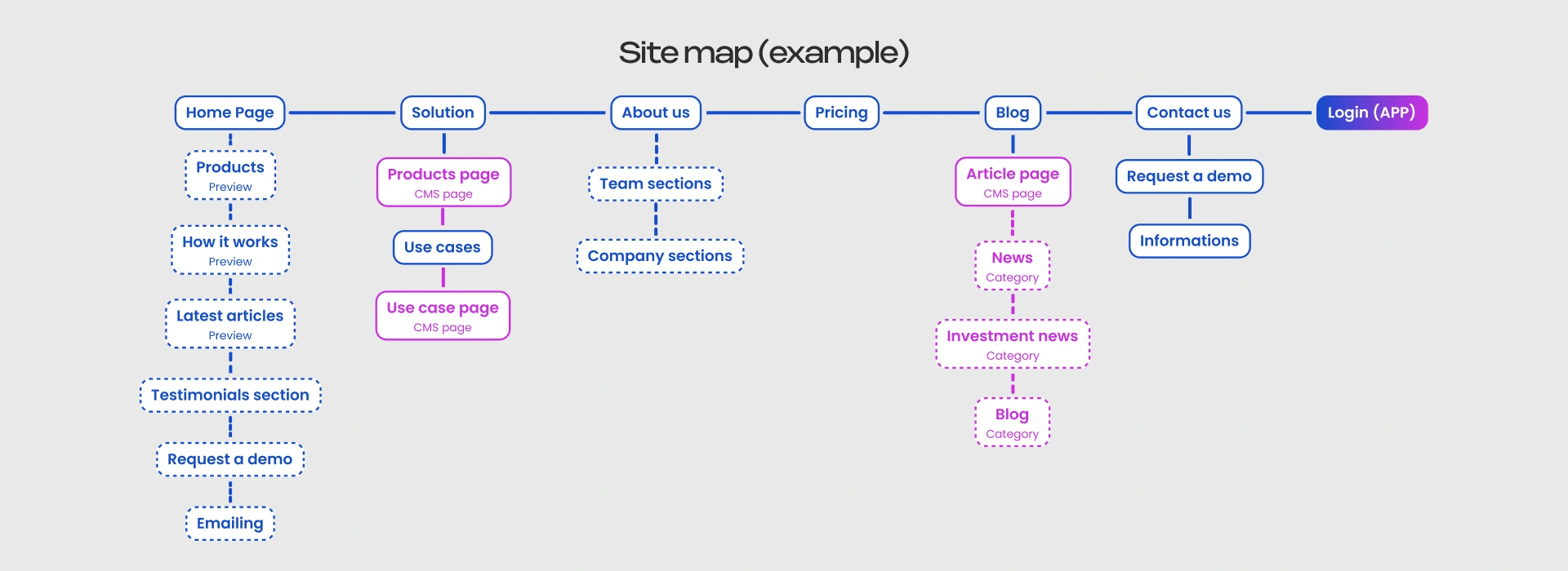
A sitemap, agreed on with a designer and strategist before design work starts, heads this off. It puts a number on how big the project actually is, gets everyone aligned on the same list of pages before opinions start pulling in different directions, and gives you something concrete to point back to the next time someone says "can we also add.”
How to Structure an IT Product Website
No two IT products are the same, so no two homepages should look identical either.
A visitor lands, and within seconds they're deciding three things:
- What kind of thing is this?
- Can I picture this actually working for me?
- Can I trust these people?
If that clarity isn't there, the visitor leaves. Even if your product would have solved their exact problem.
This article is about the homepage itself, the sections that go on it. If you're also mapping out the rest of the website, like what a pricing page or an about page needs to do for a visitor who's further along in their research, we covered that in B2B Website as a Sales Funnel.
To make each section concrete, each section below comes with a real example from a company doing that particular job well. Included here purely as reference points for what "good" looks like in practice.
Hero: what is the product and the value
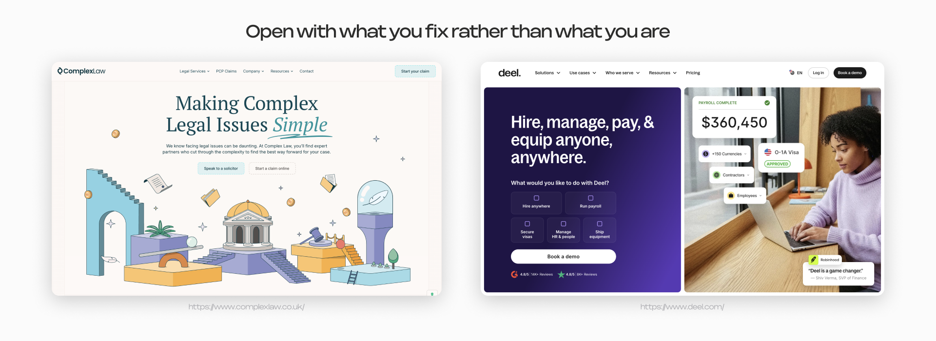
A product name alone carries no weight when the product is complicated. An umbrella sells itself the second you see it. A warehouse management system doesn't get that luxury. Pair the name with the outcome instead: "Cuts inventory time by 3x through automatic stock tracking" tells a visitor something an umbrella never had to.
Product demo: reduce the guesswork
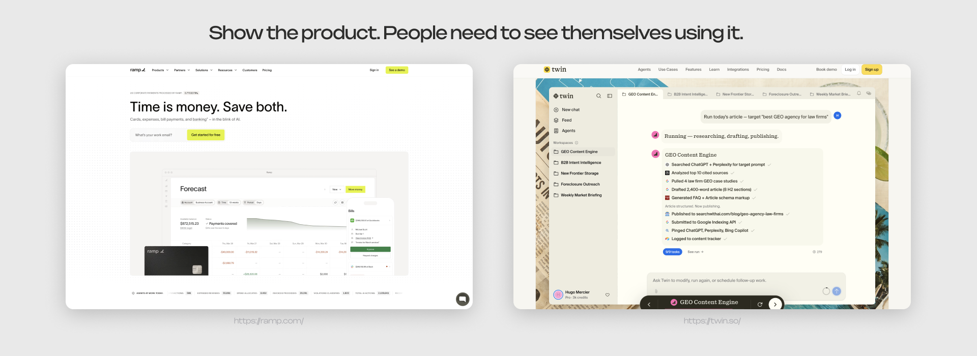
Show a screenshot, a short video, or an interactive walkthrough. If the visitor can picture themselves using the product, they’re more likely to keep exploring your website. And the next step, a demo request or a trial signup, feels much smaller.
Trust block: give people a reason to believe you
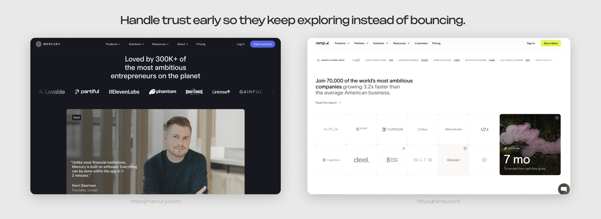
This is where most of the credibility gets built, and where most homepages underinvest. What tends to close the trust question:
- client logos, especially recognizable ones
- hard numbers: implementations completed, data volume processed, years in the market
- integrations with well-known systems, which signal technical maturity on their own
- licenses, certifications, and audits, if you have them
- a case study with a real result attached
Conference talks, partner logos, and awards add weight too. The point is the same across all of it: make the visitor feel like the risk is lower than they assumed walking in.
Speed belongs in this conversation too, even though it rarely gets talked about as a trust signal. A technical visitor reads a slow, bloated page as a sign of a poorly built product, whether that's fair or not. If the website itself feels sluggish, the assumption is that the product will too.
Call to action: make the next step obvious
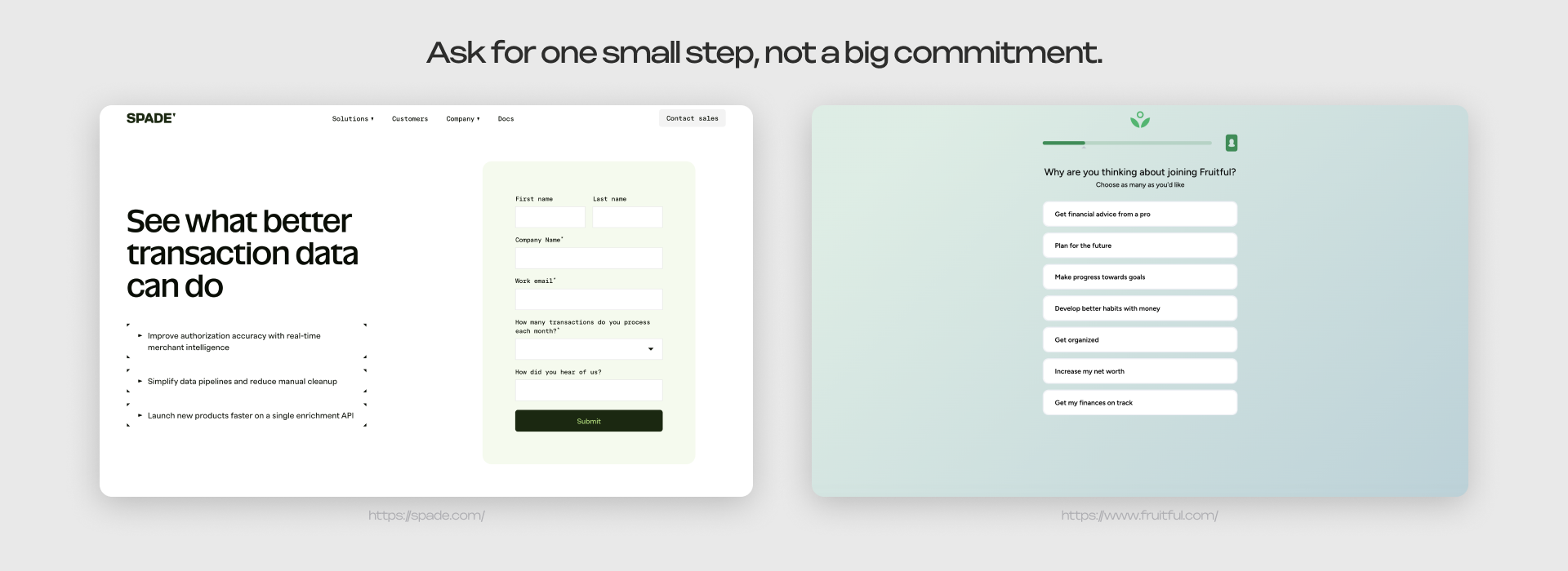
Nobody explains a complex product in a five-minute call, so "buy now" rarely fits. What you're actually asking for is a consultation about a specific problem, a demo slot, or trial access. The form itself can be a button, a short field, or a quiz for something that needs qualifying up front. Whatever it is, the visitor should know exactly what happens after they submit it.
Implementation: remove the fear of complexity
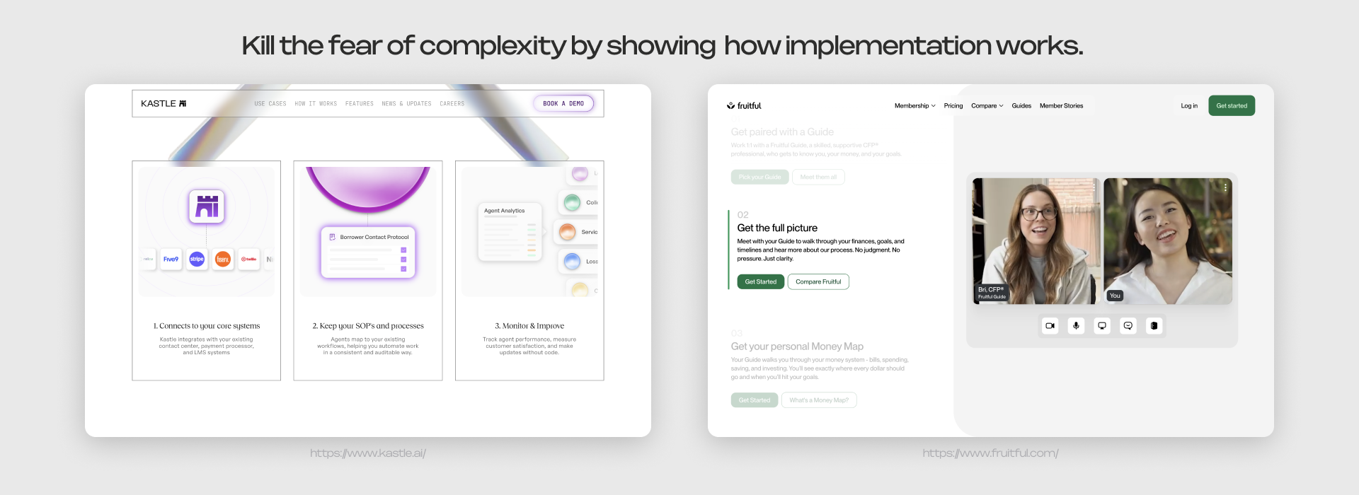
Complexity is one of the biggest silent objections in IT sales. Walk visitors through what happens after purchase, step by step. Four to five steps is plenty, enough to make the process feel real without turning it into a technical manual. A visible process is easier to say yes to than an invisible one.
Advantages: answer the comparison question directly
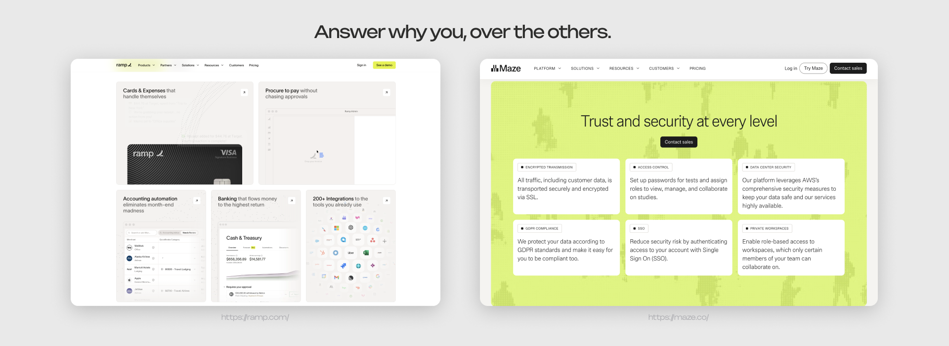
This section answers why this product, specifically, over the alternatives. That could be industry-specific experience, a different approach to the problem, or more flexible implementation terms. State it plainly enough that a visitor can easily compare you against the alternative they're already considering, without having to dig for it.
Content: case studies, articles, updates
Case studies work because they let a prospect map someone else's results onto their own situation. Be more specific than problem-solution: add conversations that happened, concerns and how you handle them, outcomes. If you have enough of them, filter by industry or use case so people can find the one that looks like their own. If organic search matters to you, give case studies their own pages instead of stacking them on one.
News and dated posts matter too. They signal the company is active and paying attention to its own market, not settling for a homepage that hasn't changed in years.
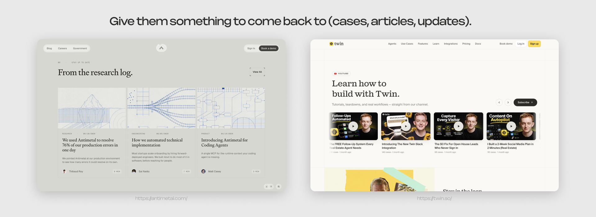
There's a newer reason content matters. People are increasingly asking AI tools these questions directly, and those tools tend to pull from content that's specific and structured, real numbers, real claims. Marketing language doesn't get quoted.
Between building trust, pulling in the right visitors through search, and giving AI tools something worth quoting, content ends up doing more work than most homepages give it credit for.
What this means for your website
None of these sections prove themselves just by existing. The only way to know if one's actually working is to watch where people leave.
A spike right after the hero means the value isn't landing.
If visitors make it through the demo and the trust block but disappear before implementation, complexity is killing the deal, not lack of interest.
Look at drop-off by section instead of one flat bounce rate, and you'll know exactly which part of the page to fix instead of guessing.
One more thing worth remembering: your founder and your technical lead will never rank these sections the same way, and that's fine.
The page isn't meant to make them agree with each other. It's meant to give each of them what they personally need to keep moving forward. So when marketing and engineering disagree about what deserves more space, there's a simple way to settle it: whichever version gets you closer to answering what is this, would it work for me, can I trust you, wins the argument.