Why the IT niche is a place to stand out
The market is saturated and new startups launch every day, so finding a design concept that gets remembered feels harder than it should. It sounds like a basic branding goal. So why is it this complicated?
Without a method, you'll fall into the same trap thousands of companies already fell into: another website with an abstract gradient blob and a generic dashboard mockup. The good news is there's still room to build a visual language nobody else has. You just need to stop reaching for whatever's trending and build a thinking process instead.
The method
Step 1: Write down associations
The first step sounds like a design-school warmup: list the direct and indirect associations your product should trigger.
The point is to create a clear mental model of the product. That model becomes the foundation for every visual decision, from the style and metaphor to the graphic technique, so the design stays consistent with what the brand stands for.
Cloud storage gives you an easy example. Direct associations are the obvious stuff: files, folders, syncing. Indirect ones are what actually sells the product: never losing a file, working from anywhere, trusting the backup is real. The indirect list is usually where the interesting concept comes from, because every competitor already used up the direct one.
Step 2: Choose your main visual object
IT company websites tend to settle on one of a few approaches: a living mascot, a single 3D object, or a system of abstract imagery with no character at all. None is inherently better. What matters is whether the choice comes from the brand or from whatever's easiest to brief, and there's a useful cautionary tale for that from outside IT entirely.
In 2017, the agency Buck built an illustration system for Facebook called Alegria: flat figures with long limbs, small heads, skin in shades of blue and purple. It caught on fast. Within a couple of years, companies including Google, Slack, Airbnb, WeTransfer, and Lyft had adopted illustration systems with many of the same visual characteristics.

That's exactly where it broke. On one hand, it was a distinctive, simple, approachable style, easy enough for anyone to produce, which is a real help for a newly formed company with no design budget. On the other hand, once thousands of companies were using nearly identical illustrations to say the same thing, friendly, warm, inclusive, the friendliness stopped meaning anything. People stopped seeing any real value behind it, because the style no longer told them anything specific about the company using it.
That's the actual risk of chasing a trend too closely. It quietly erodes the exact thing you're trying to build: a sense that this brand looked at itself and made a deliberate choice, instead of reaching for whatever everyone else was already using.
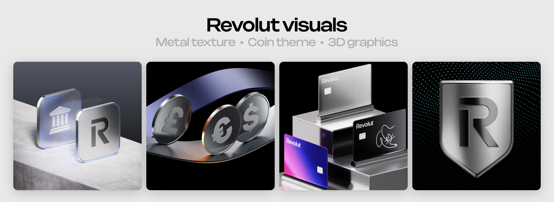
You don't need a character to avoid that trap. Revolut has no mascot, but it holds a consistent system of clean, high-tech, modern visuals that reads the same everywhere it appears, and that consistency alone is what makes it recognizable.
Both approaches work when they're grown out of the brand's own specifics instead of copied from someone else's website. That's the part that doesn't expire when the next trend replaces this one.
Step 3: Use the "specific to general" principle
Agree early on which colors, textures, and objects work, and which are off the table. Write it down before creating anything. That gives the team a shared criterion to accept or reject ideas later, instead of arguing over personal taste at the midpoint of the project.
Step 4: Find references for form, material, and texture
Pinterest is the obvious choice for material and texture references, and it still earns its place. Its recommendation algorithm can surface something you'd never have typed into a search box yourself.
Look at other websites too, not just direct competitors. Your own industry is a good place to start, to see whether you want to follow those patterns or break from them on purpose, but some of the best references come from completely unrelated fields. A shape, a background, or a layout idea from a fashion or a museum's website can spark something your own industry would never have suggested.
Awwwards, Land-Book, and SiteInspire are curated galleries of real, shipped websites sorted by industry and style. Recent.Design pulls in what's launching right now. All four beat a generic mood board when what you're actually deciding is layout, motion, and how a concept holds up across a whole site instead of one hero image.
Step 5: Generate the object in AI models
I get the instinct to treat AI as cheating here, like it can only lead to generic results. Used the right way, it helps validate hypotheses and refine existing ideas, rather than replacing the thinking that happens in steps 1 through 4.
Different models are trained differently and interpret the same prompt through their own architectures. Running one prompt through several models gives you different hypotheses about what the idea could become, not just five versions of the same answer.
Examples of Product Design Concepts
Let's look at two products in the same category but with completely different design concepts. Each one started by responding to its own audience, instead of following what was trending.
Notion
Notion talks to a broad, mostly non-technical crowd who need the product to feel approachable rather than powerful. Its brand leans on warm, hand-drawn characters: people building, thinking, working side by side. Some early users have said the illustrations were the reason they tried the product in the first place, which is a rare thing for a piece of branding to actually cause.

Linear
Linear sells to engineering and product teams who spend all day in dense, technical tools. Its brand goes almost the opposite direction from Notion: restrained, dark, precise, no characters anywhere. The visual language reads as fast and serious rather than friendly, because that's what its audience actually responds to.

As you can see, the two brands started from the same place: understanding what the product is actually worth to the person using it, then building a visual idea around that, not around a trend.
From there it comes down to two things.
- Know your user's mindset well enough that the visual speaks to them specifically.
- Know your industry well enough to name the clichés you want to avoid.